
Date & Time
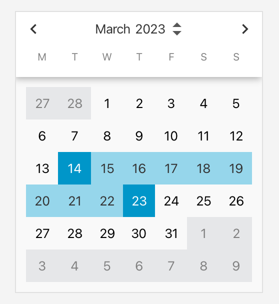
CalendarView
Advanced monthly calendar with single, multi, and date-range selection modes. Supports earliest/latest date limits and customisable header layouts.
A rich open-source collection of polished JavaFX controls and utilities — from date pickers and search fields to paging, tree views, notification centers, and more.
The fastest way to explore GemsFX — browse every control, read its manual and run its demo, without writing a single line of code.
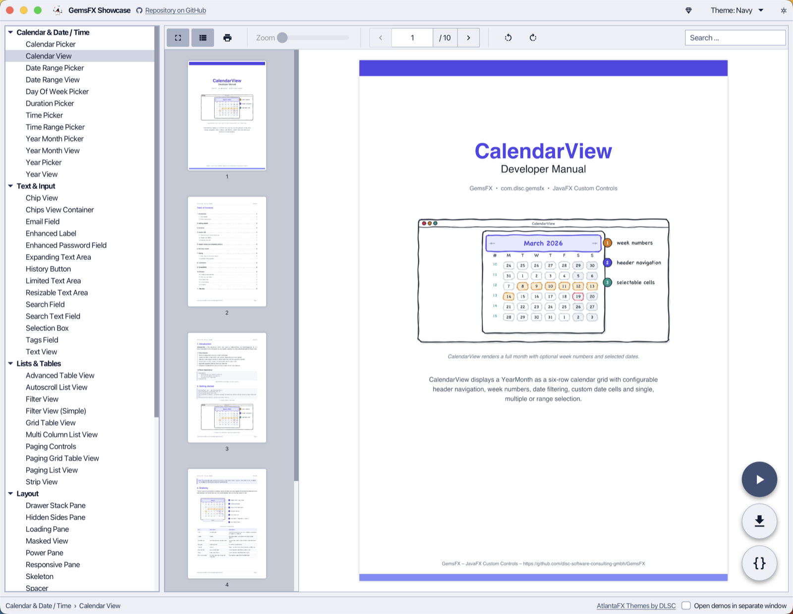
The installer is provided by jDeploy and is available for macOS, Windows and Linux. The application updates itself whenever a new version of GemsFX is released.
Prefer running it from the sources? Use Maven:
mvn javafx:run -f gemsfx-showcase/pom.xml
Add GemsFX to your project with Maven or Gradle.
<dependency>
    <groupId>com.dlsc.gemsfx</groupId>
    <artifactId>gemsfx</artifactId>
    <version>4.4.2</version>
</dependency>
implementation 'com.dlsc.gemsfx:gemsfx:4.4.2'
// in your module-info.java
requires com.dlsc.gemsfx;
Over 60 production-ready controls. Use the filters or search to find what you need.
No controls match your search.
Advanced monthly calendar with single, multi, and date-range selection modes. Supports earliest/latest date limits and customisable header layouts.
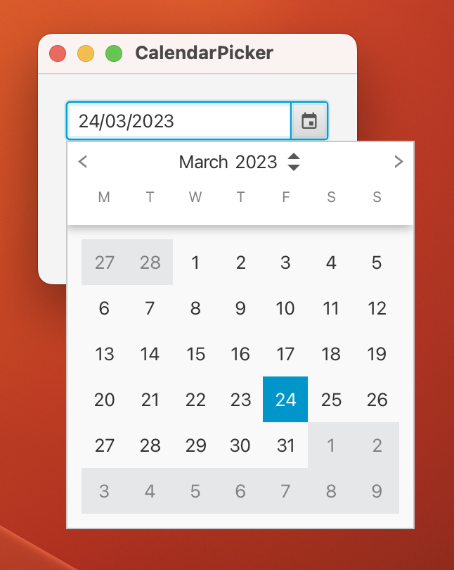
A compact field + popup picker built on top of CalendarView. Suitable for forms and toolbars.
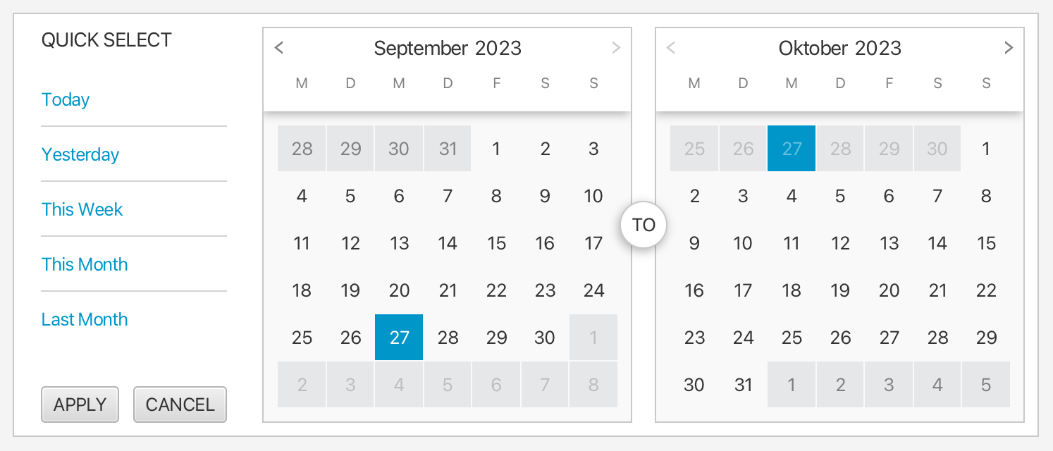
Side-by-side dual-month selector for picking a start/end date range, with built-in presets (Today, Last 7 days, etc.).

Compact field + popup date range picker, wrapping DateRangeView for use in forms and filter bars.
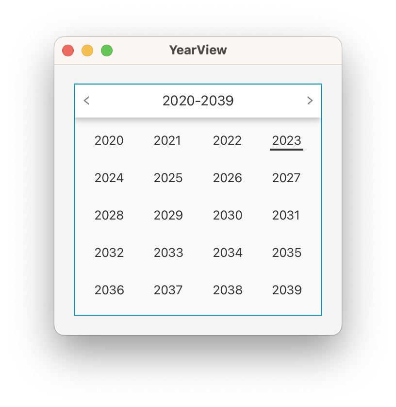
Grid-based year selector with configurable rows and columns and earliest/latest year constraints.
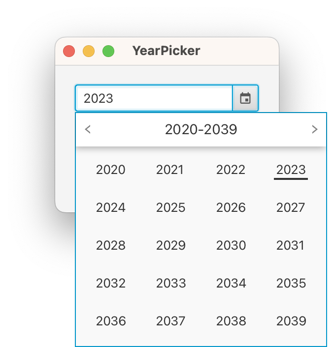
Inline or popup year selection control built on top of YearView.
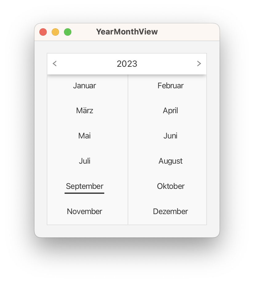
Monthly grid control that lets the user pick a year-month combination.
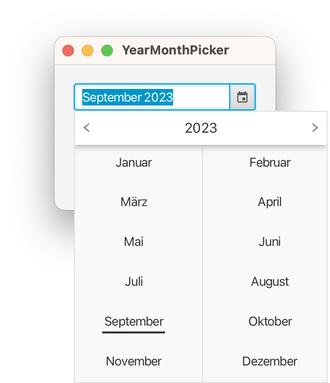
Compact field + popup picker for selecting a year-month value.
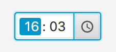
Hour/minute/second time picker with 12 or 24-hour clock, popup support, and linked-field rollover scrolling.

Spinner-style picker for entering durations (days, hours, minutes, seconds, milliseconds) with optional popup.
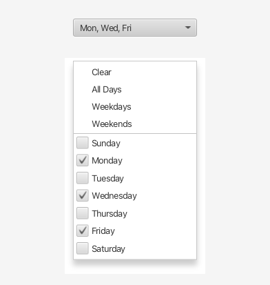
Picker for selecting one or several days of the week. Comes with quick actions for weekdays, weekends, and all days.
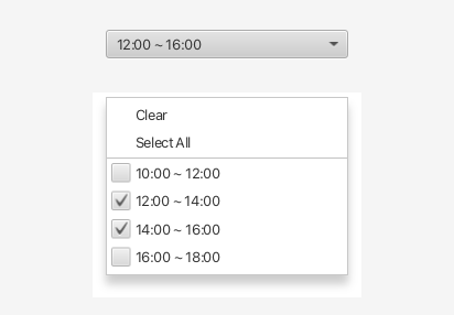
Picker for selecting one or more time ranges — useful for shifts, opening hours, or booking slots.
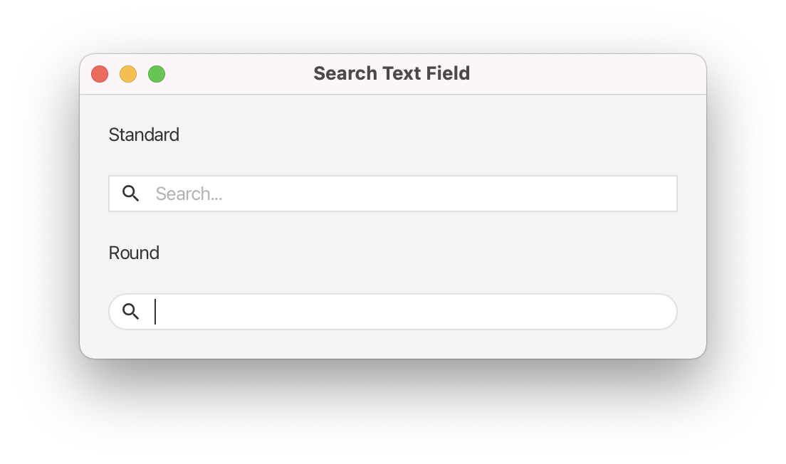
Styled text field with a built-in search icon and optional pill/round appearance, perfect for toolbars and filter bars.
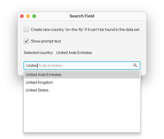
Powerful auto-complete field with a suggestion popup, history management, configurable commit behaviour, and search icon.
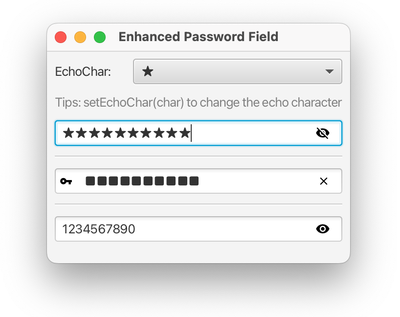
Password field with a show/hide toggle so users can reveal the text they typed.
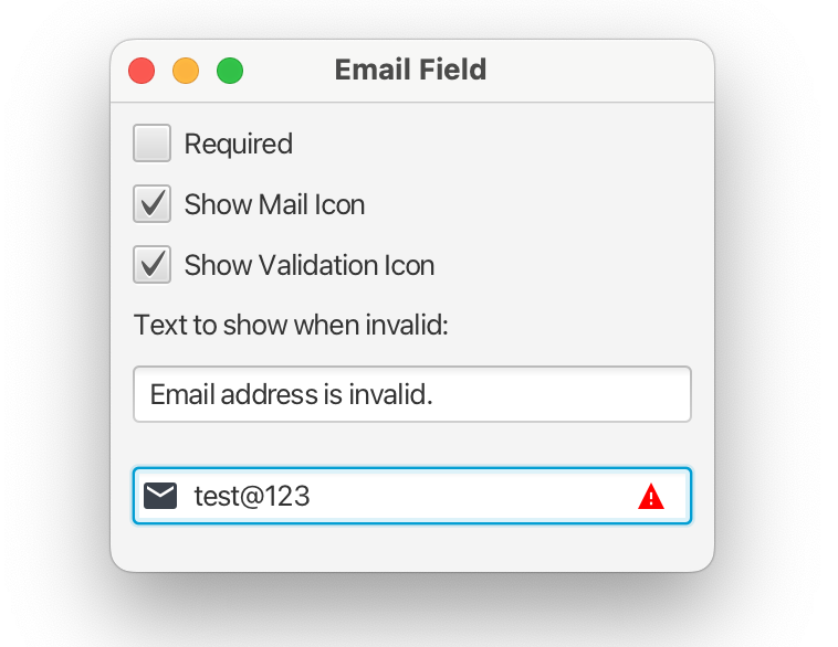
Text field with built-in email syntax validation, domain auto-completion, and multi-address support.
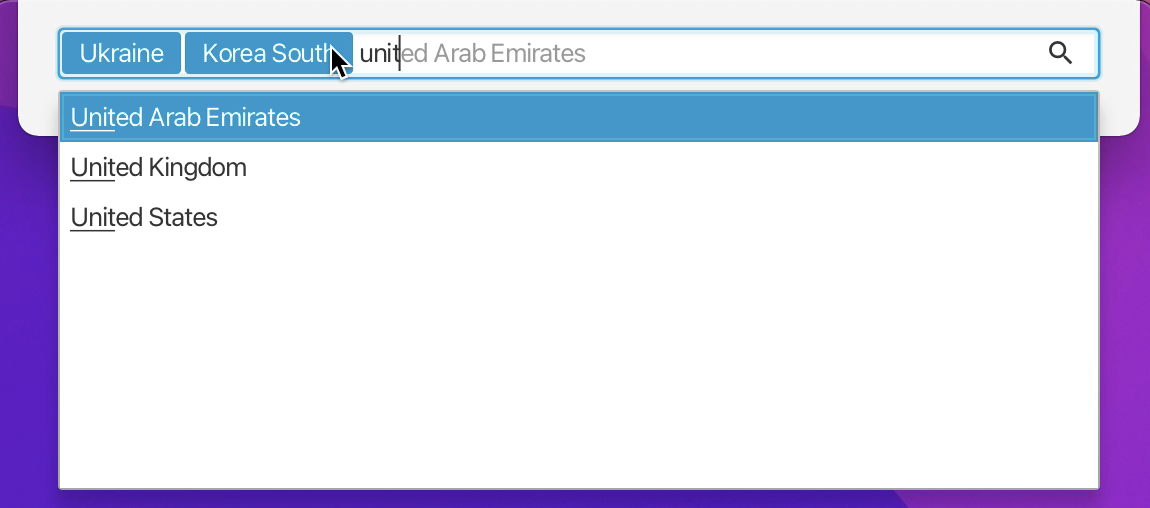
Multi-value text field where typed values are committed as removable chips. Supports autocomplete suggestions.
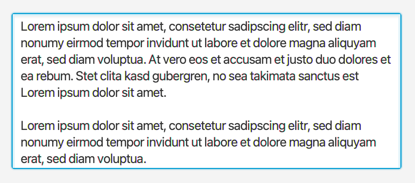
A TextArea that grows vertically to fit its content, eliminating scroll bars for short multi-line inputs.
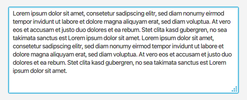
A TextArea with a drag handle that lets users resize it freely at runtime.
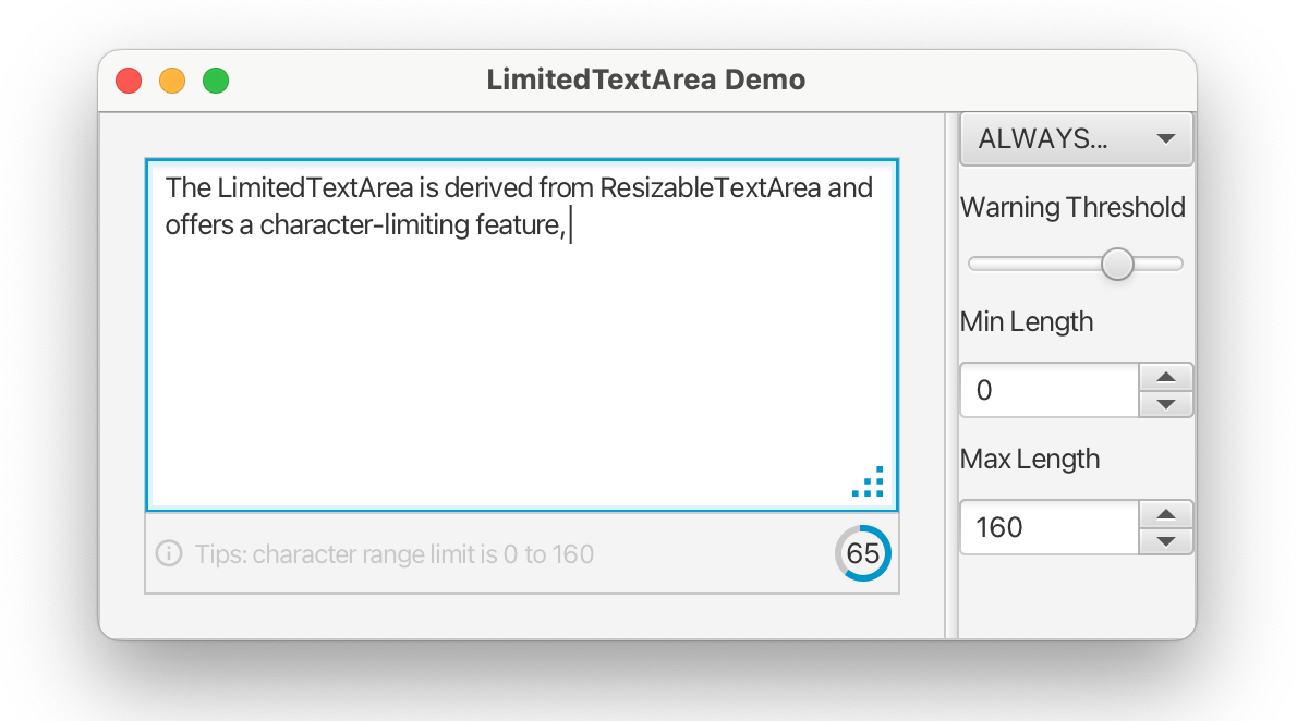
TextArea that enforces a maximum character count with a live counter and configurable warning threshold.
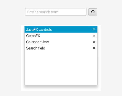
Button that shows a popup listing previously entered values. Backed by a pluggable history manager with in-memory or preferences-based storage.
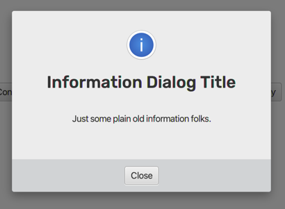
Overlay dialog system with a translucent scrim, animation, and support for multiple stacked dialogs within a single scene.
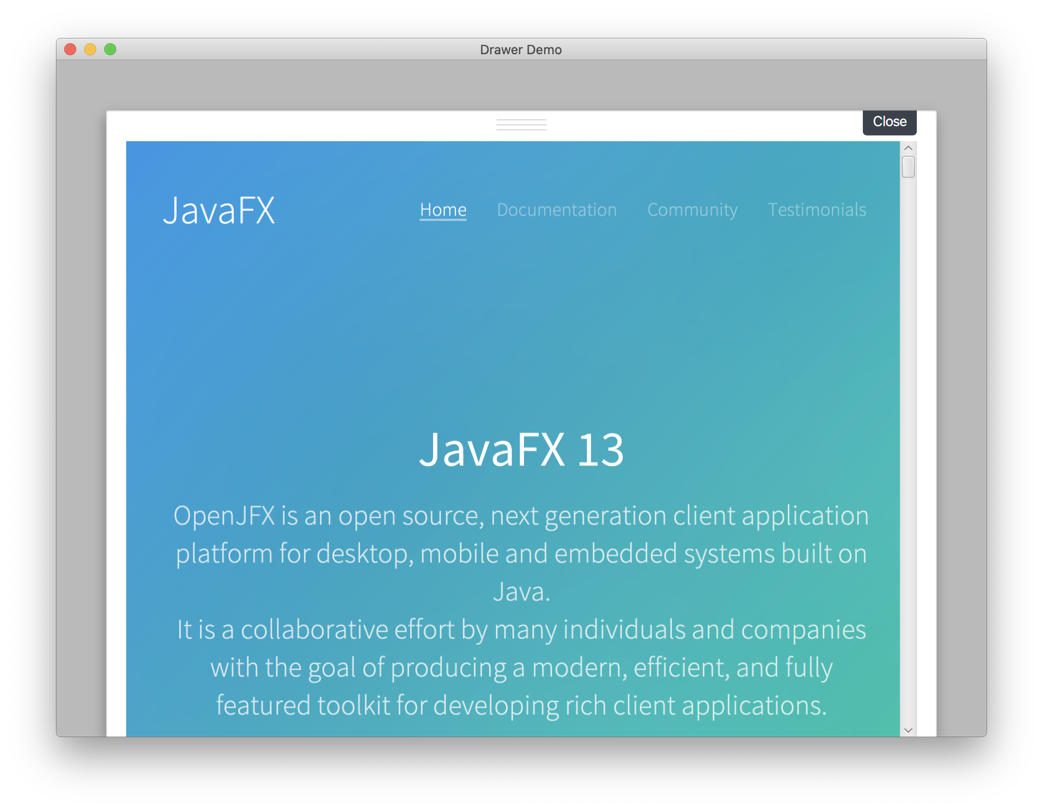
StackPane with an animated sliding drawer that rises from the bottom, with title, close gesture, and configurable max height.
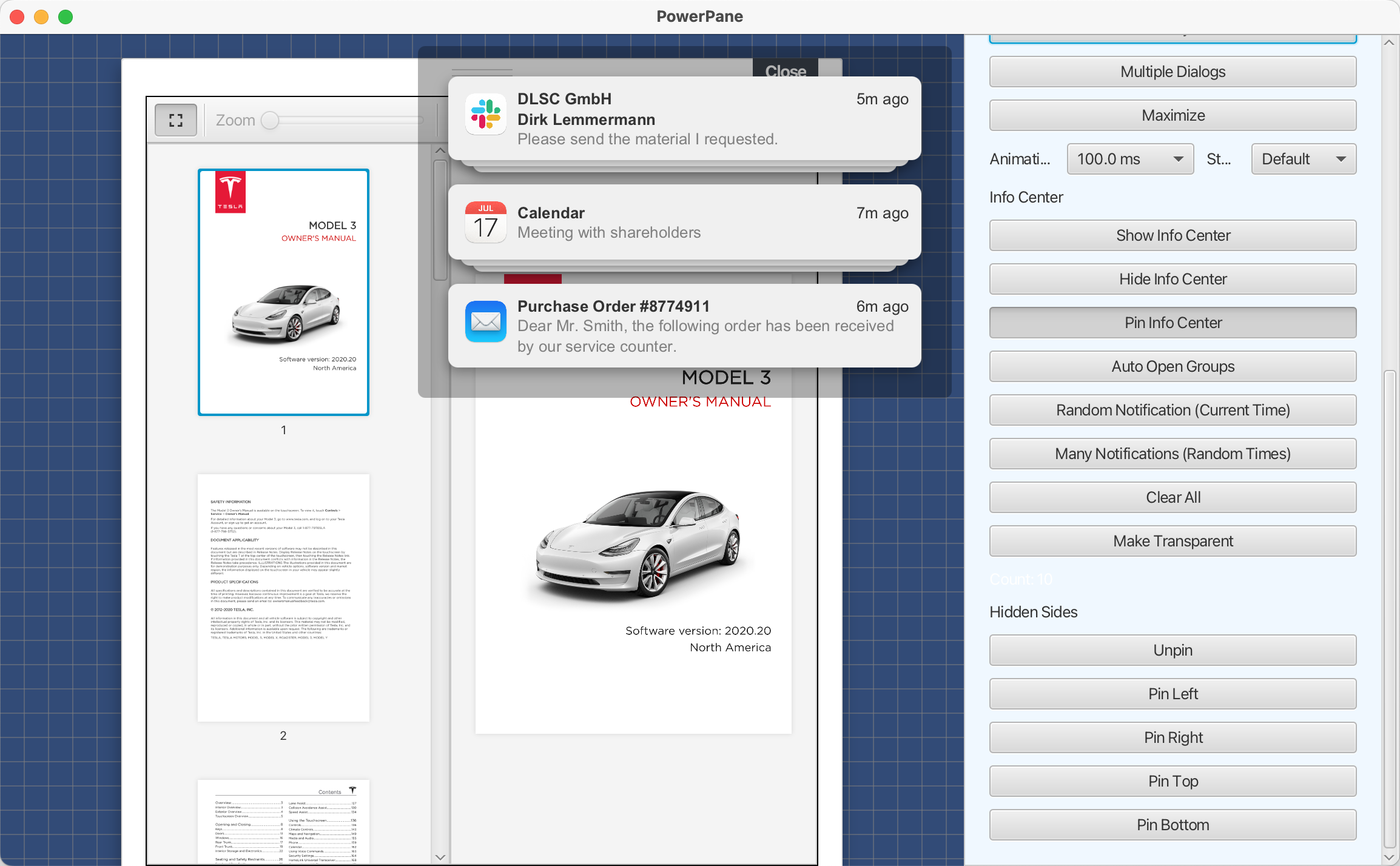
All-in-one container combining ResponsivePane, DialogPane, GlassPane, and InfoCenterPane for complex application layouts.
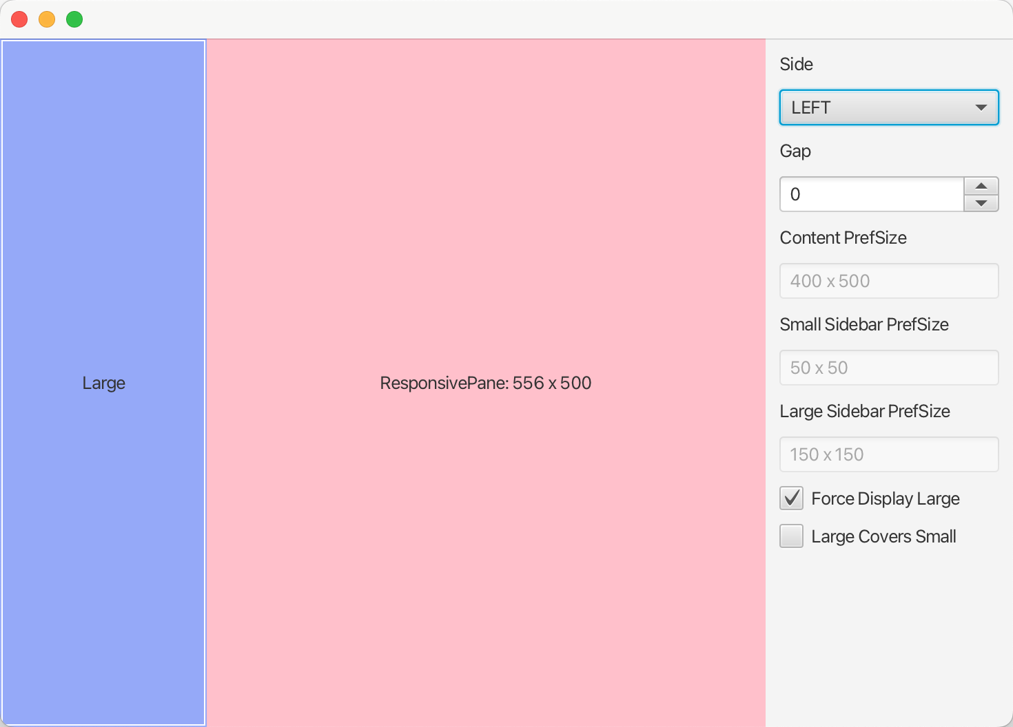
Sidebar + content pane that automatically switches between side-by-side and overlay modes based on available width.
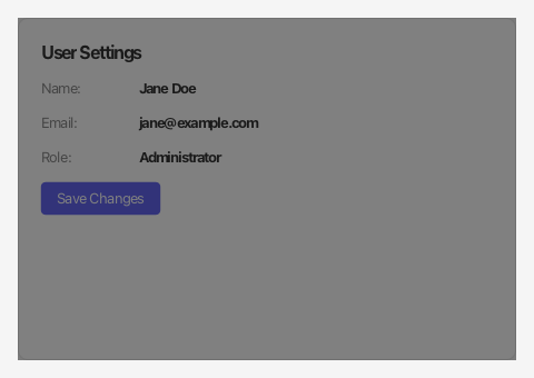
Semi-transparent overlay that blocks user interaction with underlying content. Supports fade-in/out animation and configurable opacity.
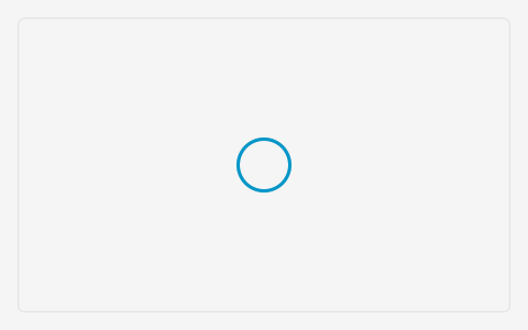
Wrapper pane displaying a progress indicator while data loads, then revealing child content. Manages IDLE, LOADING, OK, and ERROR states.
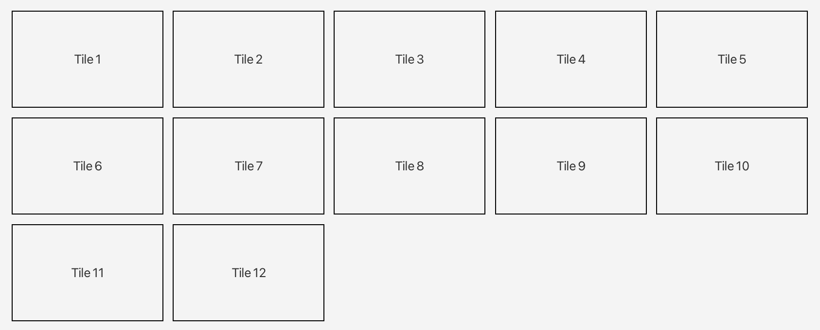
TilePane variant that stretches tiles horizontally to fill the available width, eliminating gaps on the right edge.

Pane that positions up to three children — start, center, and end — commonly used for header/toolbar layouts.
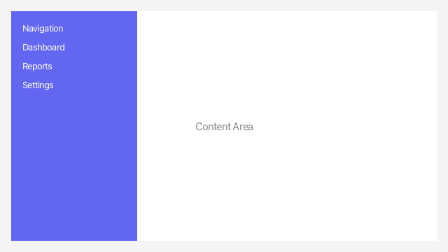
Pane that hides nodes on its four sides and slides them in when the mouse approaches an edge. Sides can also be pinned permanently.

Zoomable, scrollable image view with clip-shape support and an editable mode for selecting/replacing photos.
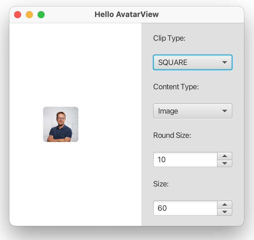
Circular user avatar with fallback initials, configurable arc radius, and size presets for user profile displays.
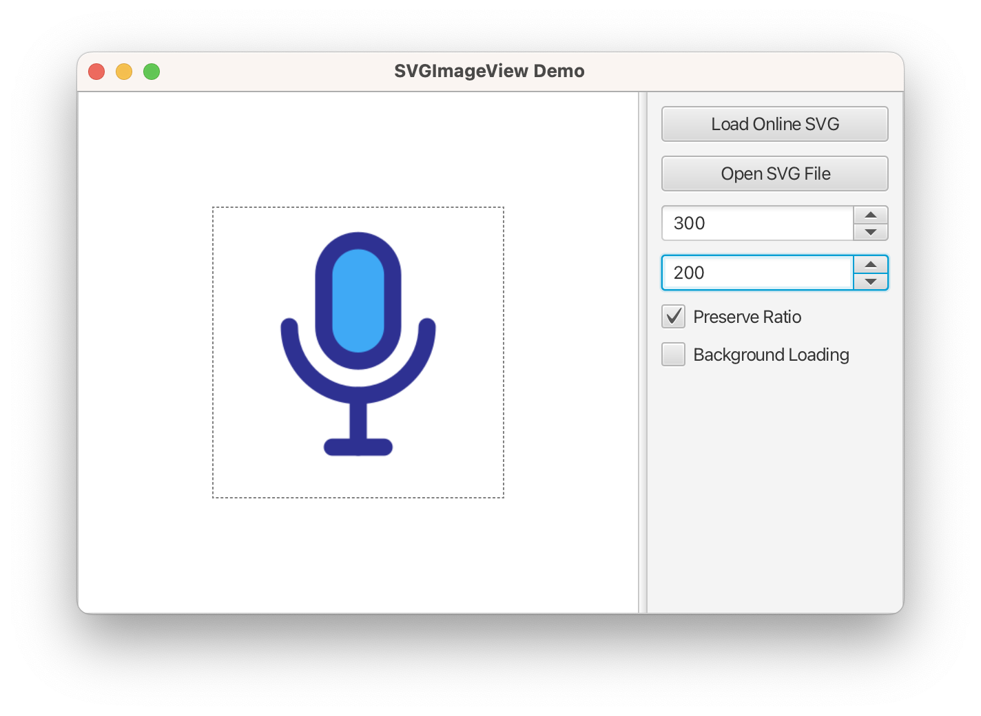
Renders scalable SVG graphics without rasterisation, powered by the JSVG library. Supports file, URL, and classpath sources.

Displays a payment method icon (Visa, Mastercard, PayPal, and more) in both light and dark variants.
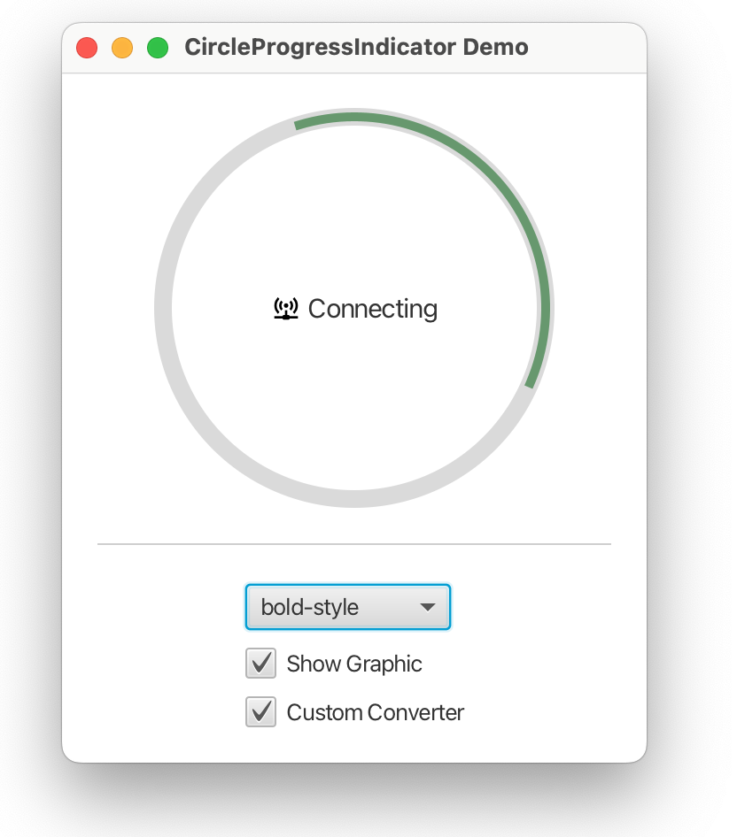
Smooth circular progress ring with configurable stroke width, fill colour, and indeterminate animation.
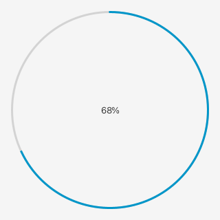
Arc-shaped progress indicator with configurable start/end angles, stroke colour, and arc size — great for dashboards.
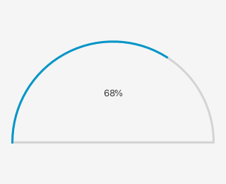
Half-circle gauge indicator, ideal for dashboard-style widgets that show a value within a bounded range.
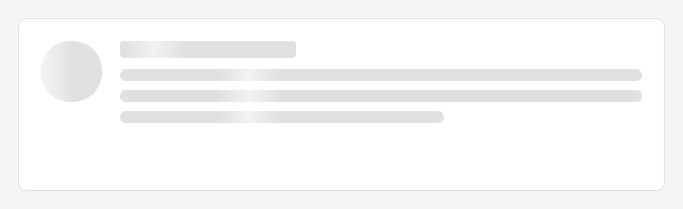
Animated shimmer placeholder for content that is still loading, available in text, rectangle, and circular variants. Use SkeletonPane to swap between placeholder and real content.
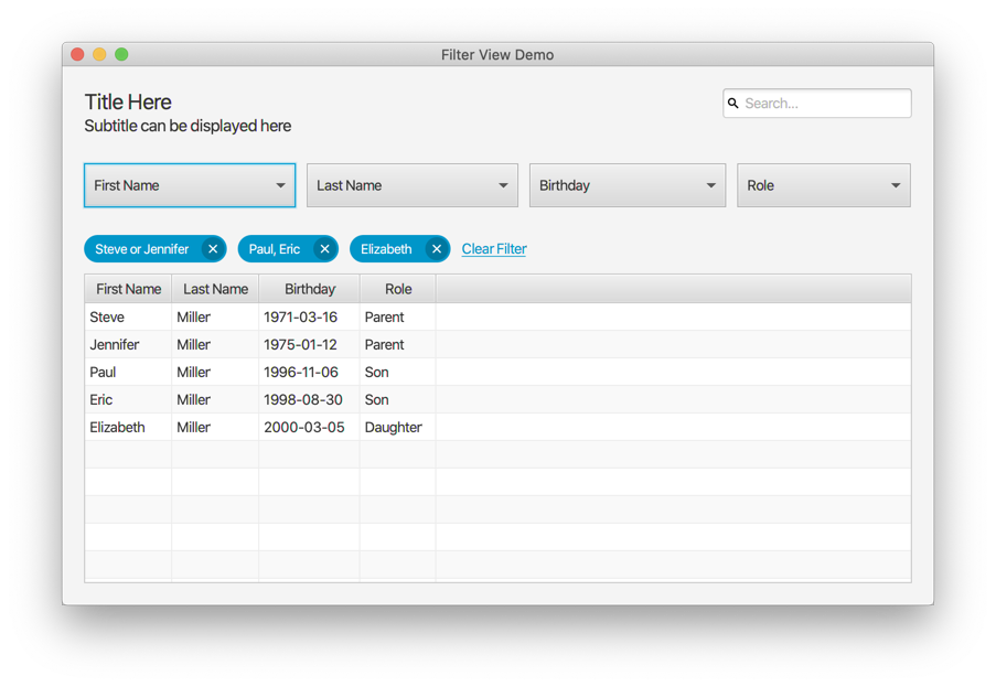
Data filtering control with a search field, dropdown filter groups, and chip display of active filters, backed by an observable predicate.
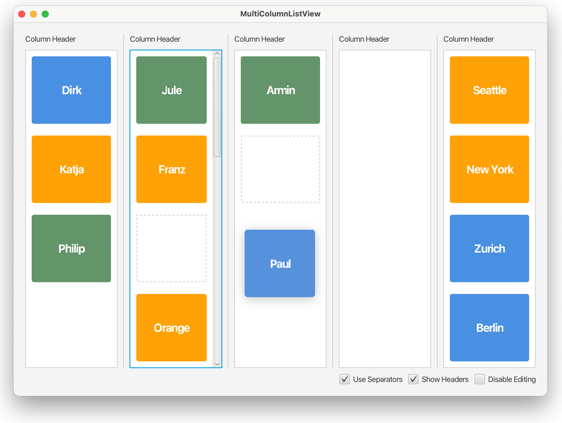
Horizontally-split list view displaying items across multiple columns with drag-and-drop reordering between columns.
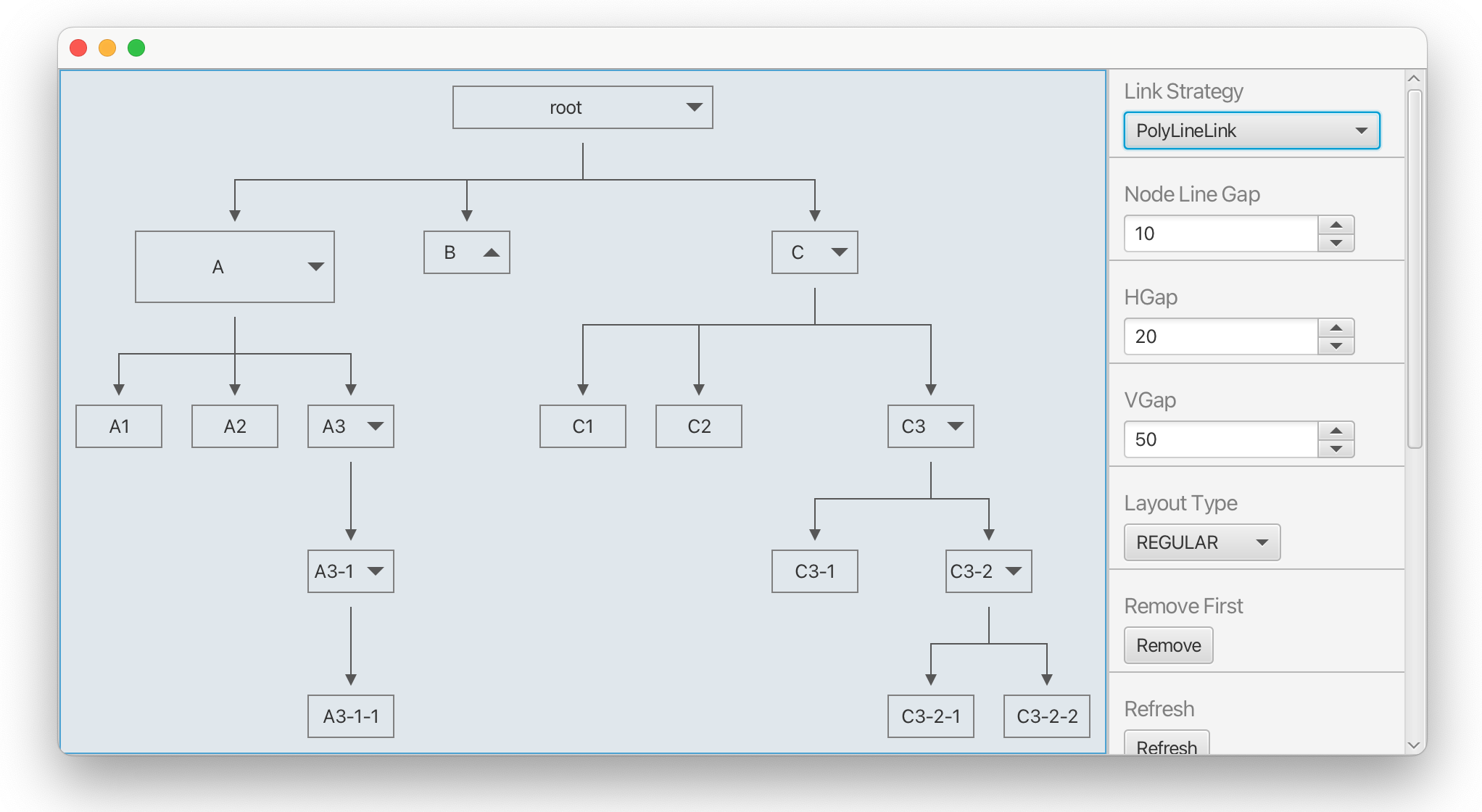
Visualises hierarchical tree structures as a node graph with configurable layout directions and animated expansion.
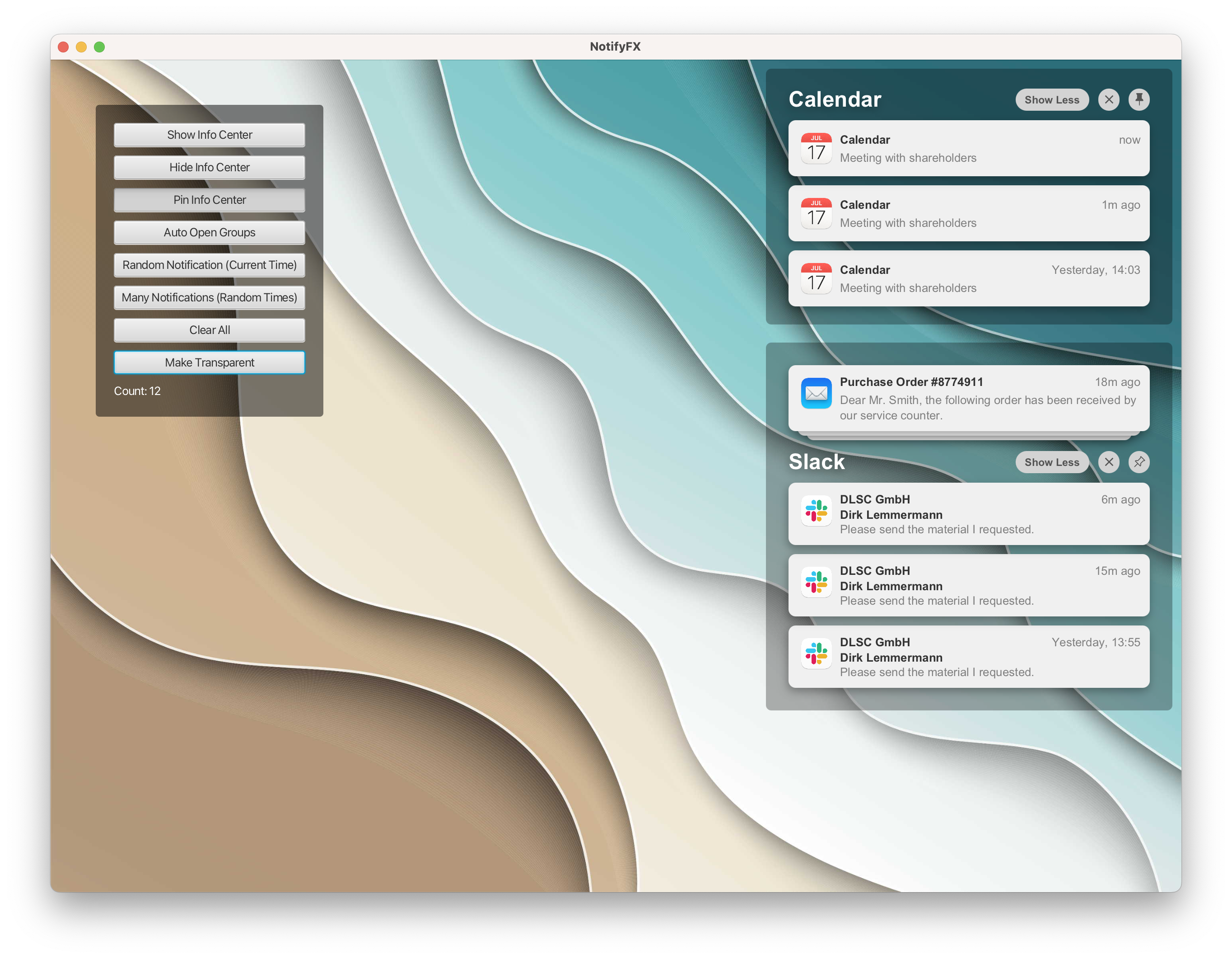
Slide-in notification center with grouped notifications, mark-as-read, and configurable animations — similar to macOS Notification Center.
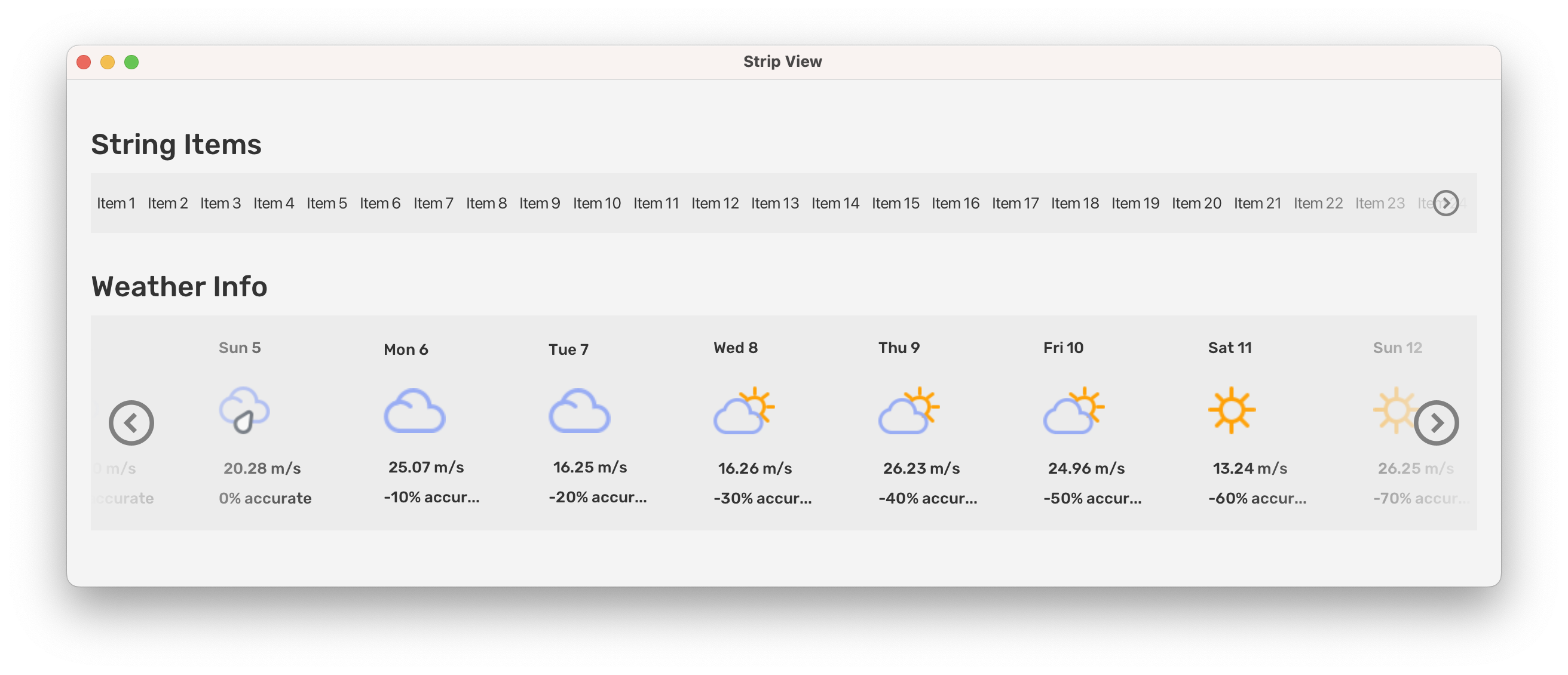
Scrollable horizontal strip of items with animated scrolling, loop selection, and always-center modes — great for carousels.
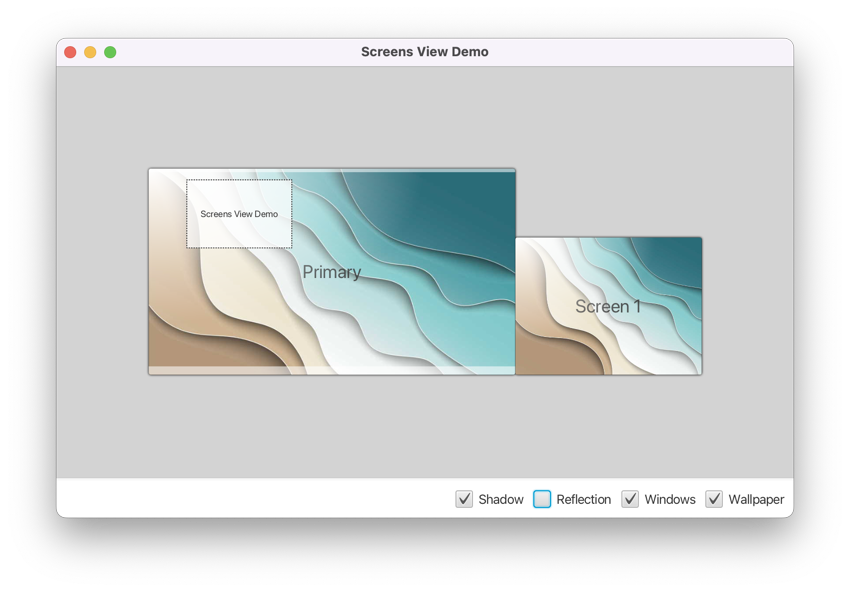
Displays the layout and geometry of all connected screens/monitors — useful for multi-monitor management UIs.
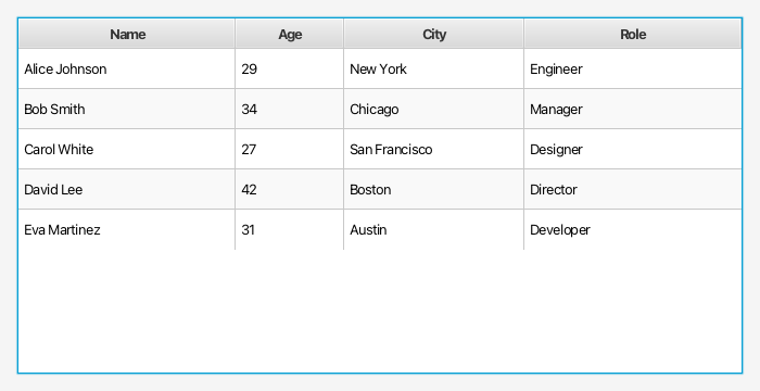
GridPane-based table with columns and rows, offering pixel-perfect cell alignment without the overhead of a full TableView.

Filter bar that arranges selection boxes, pickers, check boxes, and text fields in a consistent layout and exposes all active filters as chips.
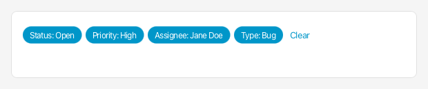
Displays the chips produced by a filter view, plus a hyperlink for clearing the current selection. Hides itself automatically when empty.
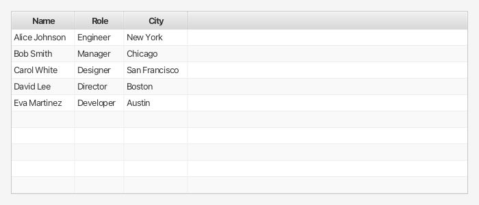
A TableView extension that can auto-resize all columns to perfectly fit their cell content.
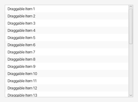
List view that scrolls automatically while the user drags an item close to its top or bottom edge — essential for drag & drop reordering.
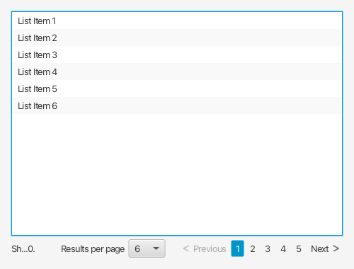
ListView with integrated pagination controls — page size selector, previous/next buttons, and page number indicators.
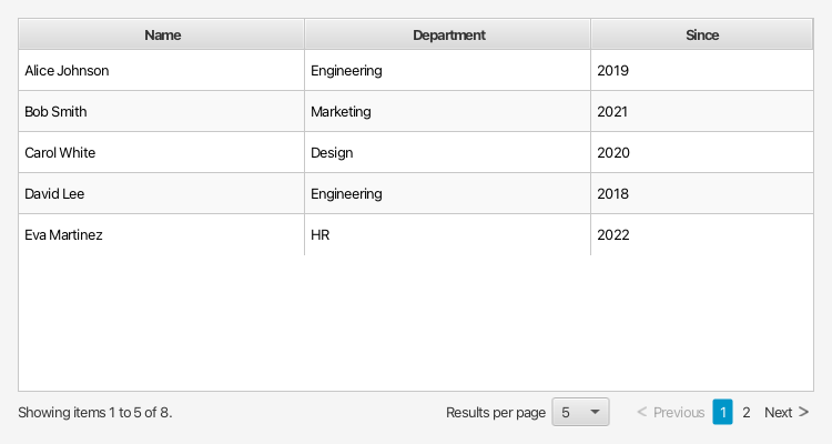
GridTableView with built-in pagination, combining the precise grid layout with page-based data loading.

Stand-alone pagination navigation bar — can be paired with any data view that needs page navigation UI.
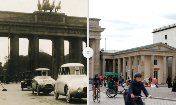
Split view with a draggable divider to compare two visual states — ideal for before/after image comparisons or UI diffs.
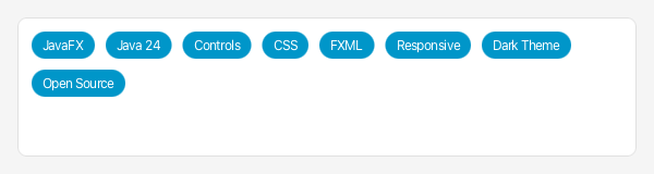
Badge-style chip node representing a model object, with an optional close button and configurable content display mode.
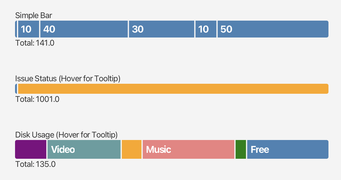
Horizontal stacked bar that visualises proportional segments, each with its own colour and configurable minimum size.
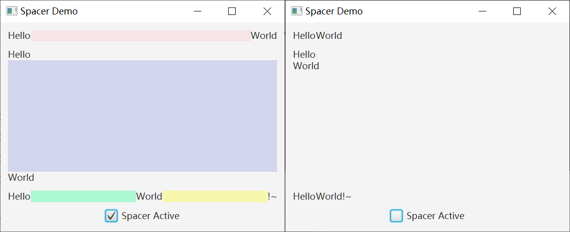
Flexible Region that expands to fill available space in HBox or VBox, eliminating boilerplate HBox.setHgrow / VBox.setVgrow calls.
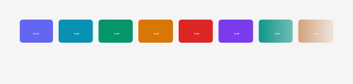
Wraps any node and applies a gradient edge mask, making content fade out at the edges for a polished overflow effect.
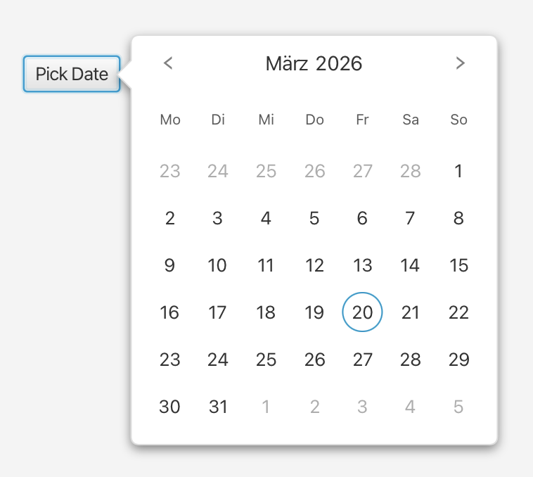
Popup overlay with a connecting arrow pointing at the owning node. Supports detachable mode and configurable arrow directions.
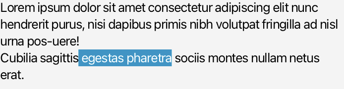
Read-only text display control with optional title, subtitle, and graphic — ideal for detail views and form labels.
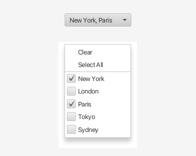
Combo box style control supporting single and multiple selection, a customisable popup, and quick actions such as "Clear" and "Select All".
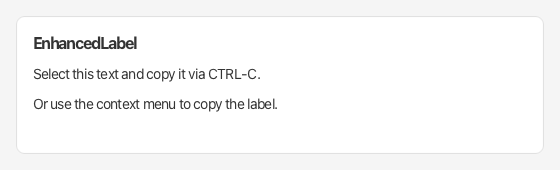
Label that can be selected and copied to the clipboard, either via keyboard shortcut or via its context menu.
Helper classes, converters, and managers in the com.dlsc.gemsfx.util package.
javafx.util.Duration.StringConverter<E extends Enum> that uses enum name or a custom label function for display.StringConverter backed by a single Function<T, String> lambda — no boilerplate subclassing.MultipleSelectionModel implementation backed by an observable list, suitable for custom list/grid controls.Reactive list bindings in the com.dlsc.gemsfx.binding package.